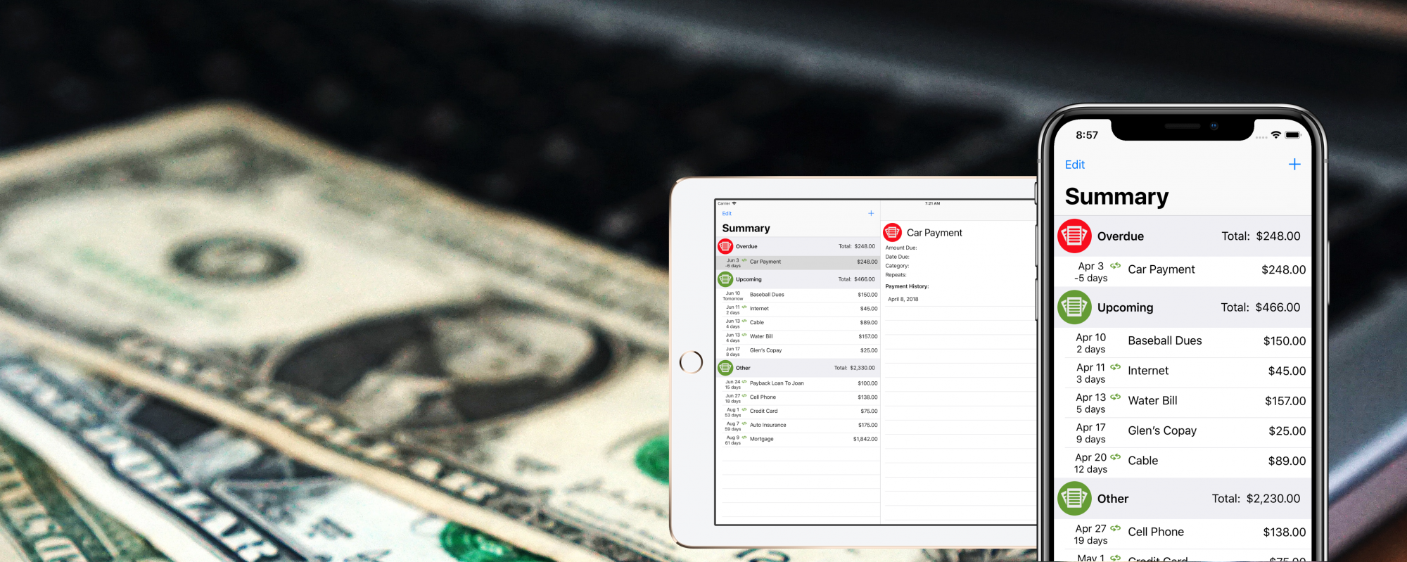
Limits by Money Master is a personal finance app, so currency symbols are an obvious part of any design. Early on in the UI design for Limits, I decided that I wanted a currency button with a badged ‘plus’ in the corner, to represent a button to add a Debit. The problem, of course, is that currencies vary all over the world, and it needed to be the currency of the current Locale of the phone, or else I would risk alienating my users immediately.
The great SF Symbols package has several currency-based glyphs, however it didn’t appear that it would be a great fit for a few reasons:
- They aren’t organized or named by Locale, so I would need to manually map every possible Locale to a glyph
- Each of the glyphs are in either a filled or empty circle, and none of them are badged – I felt the ‘plus’ sign was important to convey the intended meaning
SwiftUI’s Button view is extremely customizable – the ‘view’ of a Button can be more than just a Text label and an Image, but it can be any SwiftUI view. Perfect for a building a custom control that would be sensitive to taps.
The Finished View
Before we break down how to build the view, let’s start with the finished product:

This is, of course, 8 different representations of the Button, each in a different Locale:
- en_US
- en_GB
- fr_CH
- ro_RO
- cs_CS
- zh_CN
- ar_AE
- ms_MY
This selection of Locales is intended to show both that a variety of common currency symbols look good, but also that symbols with multiple characters will scale appropriately.
Breaking this down further, it is built in three parts — the outlined circle, the ‘plus’ badge, and the currency symbol. Let’s take them one at a time.
The Circle
Calling it a circle isn’t quite accurate. The space behind the badge isn’t actually drawn, because the badge is actually transparent – the circle would show in the negative space of the plus sign if it were. Instead, it’s an arc, drawn using a Path:
GeometryReader { geometry in
    Path { path in
        path.addArc(
            center: CGPoint(x: self.halfHeight(geometry), y: self.halfHeight(geometry)),
            radius: self.halfHeight(geometry) - self.strokeWidth(geometry),,
            startAngle: .degrees(120),
            endAngle: .degrees(160),
            clockwise: true)
    }.stroke(lineWidth: self.strokeWidth(geometry))
}
...

func halfHeight(_ geometry: GeometryProxy) -> CGFloat {
    geometry.size.height * 0.5
}

func strokeWidth(_ geometry: GeometryProxy) -> CGFloat {
    geometry.size.height * 0.06
}
This simple Path draws an arc around the center point of the component, with the radius filling out the space nearly from end to end.
The Badge
I did end up making use of the SF Symbols package — the badge itself is one of the available images:
Image(systemName: "plus.circle.fill")
    .resizable()
    .frame(width: self.badgeHeight(geometry), height: self.badgeHeight(geometry))
    .offset(x: self.badgeOffset(geometry) * -1, y: self.badgeOffset(geometry))
...

func badgeHeight(_ geometry: GeometryProxy) -> CGFloat {
    geometry.size.height * 0.4
}

func badgeOffset(_ geometry: GeometryProxy) -> CGFloat {
    halfHeight(geometry) - (badgeHeight(geometry) * 0.5)
}
The glyphs that make up the SF Symbols package makes the process of finding icons for your app simple – it saved me hours of hunting down freely available to use glyphs, and sizing them appropriately, but they can also be handy when composing Views. The frame and offset here is to size the badge, and move it to the lower left corner of the view, over the gap in the circle.
One more interesting note here – this is actually inside the same GeometryReader shown above, and sizing the badge relative to that enclosing container allows the view to scale up and down smoothly, rendering appropriately at any size.
The Currency Symbol
Finally, we draw the currency symbol in the center of the view:
@State
var locale = Locale.current
...

Text(self.currencySymbol())
    .font(Font.system(size: self.currencySize(geometry), weight: .semibold))
...

func currencySymbol() -> String {
    self.locale.currencySymbol ?? "$"
}

func currencySize(_ geometry: GeometryProxy) -> CGFloat {
    var modifier: CGFloat = 0.25
    if currencySymbol().count == 2 {
        modifier = 0.33
    } else if currencySymbol().count == 1 {
        modifier = 0.5
    }
    return geometry.size.height * modifier
}
Again, this is enclosed in the GeometryReader, so it scales up and down appropriately. The locale variable is constructed as a @State in this case for testing – it is never varied in the app, but can be set to any value in Previews. This is how I created the various previews, above.
Finally, the currencySize method varies the font size, allowing those 2 and 3 character symbols to be drawn smaller, to fit properly.
Putting it all together
Each of those three components are further combined inside a ZStack, so they’re drawn on top of each other, forming the final component.
A few final points before showing the entire code:
- There is an optional label drawn on the Main Screen of Limits, showing the text ‘Add Debit’ to the right of the button. This is controlled by changing the value of the
showLabelproperty - By default, the size of the component will be 50×50, but can be adjusted up or down with the
sizeproperty - Of course, pressing the button needs to actually do something – in this case, it will open a Sheet showing the
Add Debit/Credit View, which is attached directly to the button itself. Attaching the sheet directly to the button is a simple way ensure the button behaves the same way, no matter where it’s placed in the app!
struct NewItemButton: View {
    @State
    var showItemSheet = false

    @State
    var showLabel = false

    @State
    var size: CGFloat = 50

    @State
    var locale = Locale.current

    var body: some View {
        Button(action: {
            self.showItemSheet = true
        }) {
            HStack {
                GeometryReader { geometry in
                    ZStack {
                        //Draw the Circle
                        Path { path in
                            path.addArc(
                                center: CGPoint(x: self.halfHeight(geometry), y: self.halfHeight(geometry)),
                                radius: self.halfHeight(geometry) - self.strokeWidth(geometry),
                                startAngle: .degrees(120),
                                endAngle: .degrees(160),
                                clockwise: true)
                        }.stroke(lineWidth: self.strokeWidth(geometry))

                        //Draw the Badge
                        Image(systemName: "plus.circle.fill")
                            .resizable()
                            .frame(width: self.badgeHeight(geometry), height: self.badgeHeight(geometry))
                            .offset(x: self.badgeOffset(geometry) * -1, y: self.badgeOffset(geometry))

                        //Draw the Currency Symbol
                        Text(self.currencySymbol())
                            .font(Font.system(size: self.currencySize(geometry), weight: .semibold))
                    }
                }.frame(width: size, height: size)

                //Optionally show the Label
                if showLabel {
                    Text("Add Debit")
                }
            }
        }.sheet(isPresented: $showItemSheet) {
            Text("A Form Would Go Here!")
        }
    }

    func currencySymbol() -> String {
        self.locale.currencySymbol ?? "$"
    }

    func currencySize(_ geometry: GeometryProxy) -> CGFloat {
        var modifier: CGFloat = 0.25
        if currencySymbol().count == 2 {
            modifier = 0.33
        } else if currencySymbol().count == 1 {
            modifier = 0.5
        }
        return geometry.size.height * modifier
    }

   func halfHeight(_ geometry: GeometryProxy) -> CGFloat {
        geometry.size.height * 0.5
    }

    func strokeWidth(_ geometry: GeometryProxy) -> CGFloat {
        geometry.size.height * 0.06
    }

    func badgeHeight(_ geometry: GeometryProxy) -> CGFloat {
        geometry.size.height * 0.4
    }

    func badgeOffset(_ geometry: GeometryProxy) -> CGFloat {
        halfHeight(geometry) - (badgeHeight(geometry) * 0.5)
    }
}
And that’s it! SwiftUI makes a relatively complex component very straight forward to build – had I doing this in UIKit, it’s likely I would not have attempted this, as the drawing API simply is not accessible as it is SwiftUI, and the ability to compose a view is not as simple. It’s a big win!

